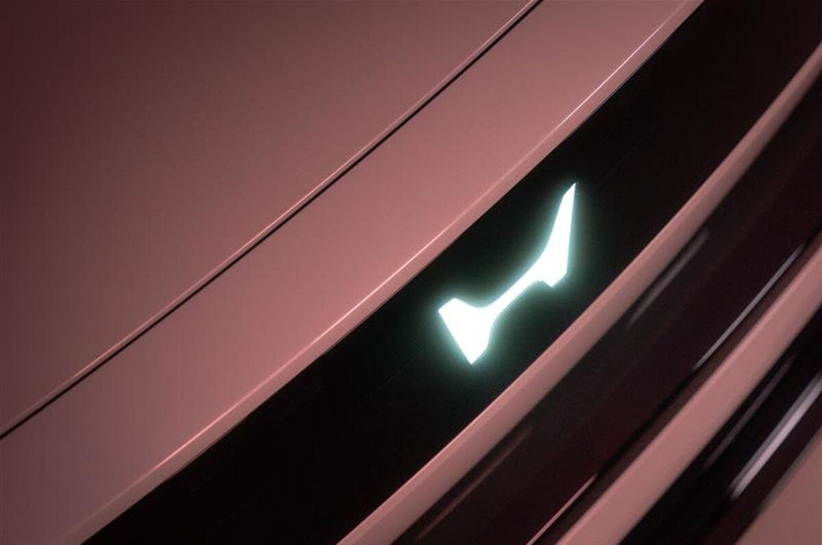
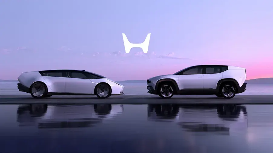
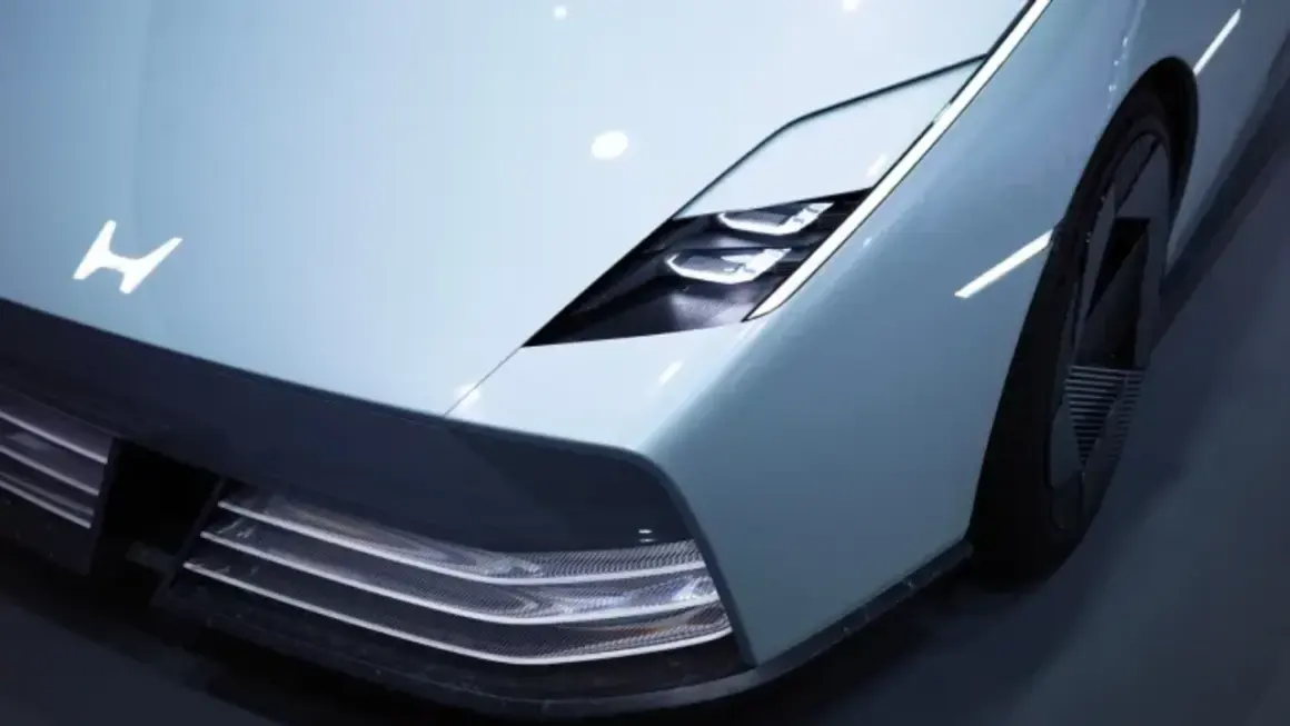
Honda is making a “groundbreaking” move by replacing its iconic “H” logo with a slightly different “H”. The Japanese giant has announced that its future electric vehicles and hybrid models will sport a new emblem starting in 2027. While the brand claims this change reflects an unwavering commitment to new value, electrification, and intelligent technologies, you could stare at the old and new badges and still wonder if you’re looking at a “Spot the Difference” puzzle.

The official corporate suggests the new design is a simplified, illuminated version of the classic mark, ditching the 3D chrome look that has adorned grilles for 43 years. This “H” is meant to symbolize a person with their arms raised. A nod to the “Power of Dreams” and the pursuit of new limits. Honda insists it embodies their transition from internal combustion engines to a fully electric future.
This rebrand might be hiding some logistical homework. During CES 2025, the brand unveiled its sleek 0 Saloon and a SUV variant, with expectations that these models would hit the US market by early 2026. However, with the new logo rollout now officially pushed to 2027, industry observers are left wondering if the “Power of Dreams” is currently taking a nap in the form of a production delay.

Beyond the cars, the change will eventually seep into dealerships, racing activities, and all communication sectors. And for those who enjoy a bit of trivia to distract from the lack of visual changes, the word “Honda” in Japanese literally translates to “original rice paddy”. So, while the brand moves toward a high-tech future of zero-emission mobility and sophisticated EV lineups, it remains firmly rooted in its agricultural linguistic origins.
Whether this “new” H actually provides new value or just a reason to update the stationery, it marks the end of an era for the chrome badge we’ve known since the early 80s.
